User interface design, more commonly known as UI Designis a central element in the design of modern digital products. In the age of mobile applications, interactive websites and complex software, a successful user interface can make all the difference between a smooth, enjoyable user experience, and laborious navigation that puts users off.
So what is UI Design ? That's what we're going to try to clarify for you in this article.
We're going to explore what UI Design really is, what it's fundamental principlesits typesas well as a few concrete examples to better understand its impact in today's digital world.
If you don't want to read the whole article, we'd like to share with you a very educational video from Barthélemy Chalvet, who explains what UI design is in detail:
Defining UI Design
What is UI (User Interface)?
The term UIor User InterfaceDesign refers to the user interface of a digital product, be it a website, mobile application or software. It is the contact surface between user and system with which it interacts. The UI comprises all the visual and interactive elements that the user sees and uses to interact with a digital machine or service. This includes, among other things, buttons, menus, text fields, icons and the general layout of the page or screen.
The main objective of UI Design is to make the user experience as simple, intuitive and efficient as possible. A good interface design allows the user to accomplish tasks quickly, without confusion, and to navigate fluidly in the application or on the site.
The difference between UI and UX (User Experience)
It's important to understand that UI and UX (User Experience) are two closely related but distinct concepts. While UI focuses on the visual aspect and layout of interactive elements, UX is about the overall user experience when using a product or service. In other words, UX focuses on optimizing user satisfaction by improving accessibility, ease of use and overall feel, while UI focuses on the "how" the user interacts visually with the product.
To sum up, we can say that UX is the structurethe skeleton of the experiment, and that the IU is the skinvisual and tactile appearance.
Fundamentals of UI Design
Good UI design relies on a few fundamental principles :
- Clarity Every element of an interface should have a clear purpose and be easy to understand. A clear interface helps avoid user confusion and errors.
- Coherence Consistency in UI Design means that elements must behave in a predictable way. This includes using the same colors, fonts and interactions across all pages or screens.
- Feedback Give visual or audible feedback when the user performs an action. For example, a button that changes color when clicked gives an immediate indication that the action has been taken.
- Simplicity Less is more in UI Design. A simple interface avoids cognitive overload for users and makes using a product more pleasant and intuitive.
- Accessibility It's essential that interfaces are accessible to a wide range of users, including those with physical or cognitive limitations. This includes the use of high contrasts, adapted text sizes and alternative descriptions for images.
These principles can be used to create easy to useThey are designed to be both aesthetically pleasing and functional, ensuring a pleasant user experience.
The different types of UI
The field of UI Design is not limited to the simple graphical interfaces we encounter on websites and mobile applications. With the rapid evolution of technologies, different types of user interface have emerged, each adapted to specific contexts and uses. Let's explore the main types of UI:
Graphical user interfaces (GUIs)
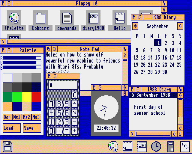
The graphic interfacesor GUI (Graphical User Interface), are the most common and familiar to most users. They are based on visual interaction between the user and the system, with graphical elements such as buttons, drop-down menus, icons and windows. The GUIs are omnipresent in operating systems such as Windows and macOS, and in the interfaces of mobile applications.
Common examples from GUI :
- Website interfaces
- Mobile applications such as Instagram and WhatsApp
- Office software such as Microsoft Word or Excel
Voice interfaces (VUI)
The voice interfacesor VUI (Voice User Interface), allow the user to interact with a system via voice, often using speech recognition. They have become popular with the emergence of voice assistants such as Siri, Google Assistant and Alexa. This type of interface is particularly useful in contexts where manual interaction is not practical or possible, such as when the user is driving a car or cooking.
Advantages of VUI :
- More natural, hands-free interaction
- Greater accessibility for users with physical limitations
Touch and gesture interfaces
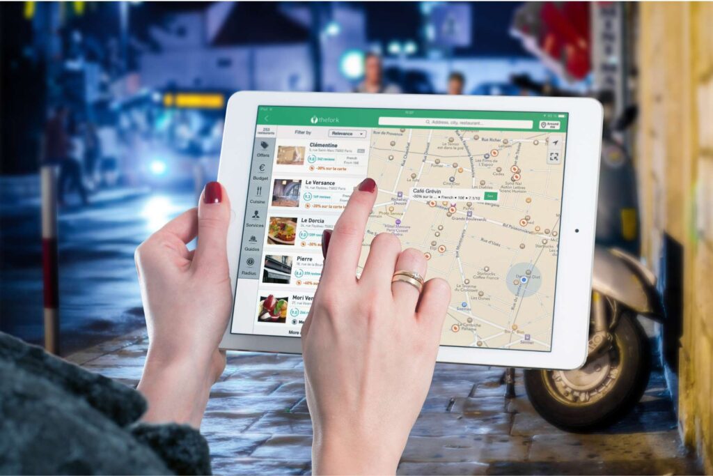
The tactile interfaces are omnipresent in our daily lives, thanks in particular to smartphones, tablets and interactive screens. These interfaces enable users to interact directly with on-screen elements via tactile gestures such as swiping, pinching or tapping.
The gestural interfacesThe technology used in the latest generation of mobile phones goes a step further, enabling a system to be controlled by physical movements without direct contact with a screen. Examples of this include the technology used in the Microsoft Kinect or virtual reality headsets.
Benefits of touch and gesture interfaces :
- Intuitiveness: gestures often correspond to natural actions (such as sweeping to delete)
- Flexibility: multi-finger commands for complex interactions
Augmented reality (AR) and virtual reality (VR) interfaces
Interfaces in augmented reality (RA) and virtual reality (VR) are increasingly present, especially in the fields of entertainment, education and vocational training. These interfaces enable total or partial immersion in a digital environment, by superimposing virtual elements on the real world (AR) or creating a fully simulated environment (VR).
- Augmented reality (AR) : Users interact with digital elements superimposed on the real world, as with Snapchat filters or the Pokémon Go game.
- Virtual reality (VR) The user is immersed in a 360° digital world, often via VR headsets such as theOculus Rift or PlayStation VR.
Advantages of AR/VR interfaces :
- Total immersion in digital experiences
- Innovative applications in sectors such as video games, medicine and architecture
Key principles of good UI Design
A good UI Design is based not only on visual aesthetics, but also on a set of fundamental principles to create an interface that is efficient, intuitive and pleasant to use. These principles are essential to ensure that the interface meets users' needs, while delivering a smooth, frustration-free experience. Let's explore the main concepts that guide the creation of a successful user interface.
Consistency and simplicity
The consistency is one of the pillars of good UI design. An interface must adopt uniform visual and functional rules throughout the entire product. This means that graphic elements such as buttons, colors and fonts must be used consistently across all pages or screens. This enables users to easier orientationThey recognize the patterns and know what to expect.
At the same time simplicity is paramount. A clean interface, free of unnecessary distractions, allows the user to concentrate on the essentials. Visit complex interfaces can quickly become confusing and frustrating, prompting the user to give up. The idea is to limit the number of visible options and prioritize key actions.
Examples of best practice:
- Reusing the same colors and button styles for similar actions.
- Limit on-screen information to avoid overloading the user.
Accessibility and inclusiveness
The inclusive design is an essential aspect of modern UI design. It is essential that interfaces are accessible to all usersincluding those with physical, visual or cognitive limitations. A good UI Designer needs to think about factors like color contrast, text size, and compatibility with assistive technologies like screen readers.
L'accessibility not only concerns people with disabilities, but also aims to make the interface easy to use in different environments (low light, ambient noise) or contexts (multi-tasking, distractions).
Examples of best practice:
- Use sufficient contrast between text and background to ensure legibility.
- Propose text alternatives for visual elements (such as images and videos).
Responsiveness and performance
L'UI Design must also take into account the responsiveness and performance interfaces. An interface that takes a long time to load or doesn't respond quickly to user actions can be perceived as frustrating and unintuitive. Visit fluid animationsthe short loading times and immediate interactions help improve the perceived quality and modernity of the interface (beware: too many animations on your websites can slow loading times and lose users).
Examples of best practice:
- Optimize page or application loading times.
- Using light entertainment to give feedback to the user without slowing down the experience.
User feedback and affordance
The user feedback is essential if users are to know that their actions have been taken into account. This can include button animations, confirmation messages or visual indicators that inform the user that an action is in progress or completed. This feedback is particularly important for reduce errors and ensure that users fully understand the impact of their actions.
The concept ofaffordance designates the way in which an interface element suggests its use to the user. For example, a button should visually indicate that it is clickable. If the affordance is well designed, the user will intuitively understand how to interact with the element without the need for further explanation.
Examples of best practice:
- A button that changes color or "sinks" when clicked.
- Visual indicators that data is being loaded.
UI Design tools and technologies
The work of a UI Designer relies on a variety ofsoftware tools and front-end technologies to create aesthetic, functional and interactive interfaces. The constant evolution of design and development technologies offers designers new opportunities to enhance the user experience. Here's an overview of the main tools and technologies used in UI Design.
Popular UI design software
The UI design software allow designers to create mock-ups, prototypes and interactive interfaces. These tools facilitate the creation of a visually coherent interface optimized for different types of screen, whether mobile, tablet or computer.
Sketch
Sketch is one of the most popular tools among UI Designers, particularly for designing mock-ups of mobile and web applications. It offers a simple, intuitive interface, enabling you to quickly create reusable components and modular grilles. One of Sketch's key features is the ability to create design systems that make it easier to manage consistency throughout a project.
Figma
Figma is a collaborative design tool that enables several designers and developers to work in real time on the same project. Its functionality cloud makes Figma particularly suitable for teams who want to share and modify designs instantly, without having to manage multiple files. Figma is also appreciated for its powerful interactive prototypingwhich allows users to simulate interactions prior to development.
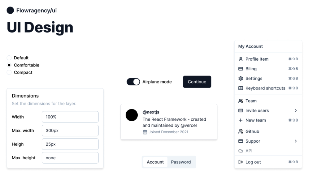
Here's an example of one of our achievements on Figma :
Adobe XD
Adobe XD is part of the Adobe suite of tools, and stands out for its simplicity and integration with other Adobe products such as Photoshop and Illustrator. It is particularly well-suited to the creation of interactive prototypes and the addition ofanimations to the interface. It allows designers to create smooth transitions between different pages or screens, making interactions more realistic during test phases.
Concrete examples of successful UI
Analyze examples ofSuccessful UI provides a better understanding of how design principles are applied in the real world. Leading digital companies invest heavily in UI Design to ensure that their interfaces are both intuitive, aesthetics and functional. Here are three outstanding UI examples that illustrate the importance of a well-designed user interface.
Example 1: Apple's user interface
Apple is often regarded as a pioneer in the field of minimalist design andintuitive user interface. The interface of Apple products, whether on macOS, iOS or iPadOS, stands out for its elegant simplicity and its visual consistency. The use of wide margins, clear icons and sober typography makes for an easy-to-understand layout. fluid navigation and a visual comfort exceptional.
Apple UI highlights :
- Coherence Every application or feature follows the same design principles, which makes it easier for the user to learn. For example, menus are always structured in a similar way, whether it's the App Store interface, Safari or Mail.
- User feedback Animations are fluid and well-calibrated, offering immediate visual feedback as the user interacts with the interface. A good example is the "tap-back on the buttons, giving the user the feeling that the action has been recorded.
- Tactile design On iOS, every element is designed to be easily operated with the fingers, optimizing the experience on mobile devices.
Example 2: Spotify UI
Spotify, the music streaming giant, has developed a user interface that is particularly suitable for consumer habits modern. Spotify's design features a modern simplified navigation and quick access to personalized content while remaining consistent with its visual identity. Spotify's mobile application is an excellent example of UI focused on fluidity and personalization.
Spotify UI highlights:
- Quick access Users can access their playlists, recent tracks or new discoveries with just a few clicks, thanks to a clear navigation bar at the bottom of the screen.
- Personalization The interface adapts to the user's musical preferences, giving priority to frequently-listened-to artists and playlists.
- Visual and audio feedback The transitions between songs and different sections of the application are fluid, and sound and visual notifications help users understand their actions instantly.
Example 3: Airbnb's mobile application
The Airbnb is another example of a very successful UI, mainly because of its discovery-oriented design and ease of use. Airbnb has made finding a vacation home or local activity easy and enjoyable, even for novice users.
Airbnb UI highlights:
- Intuitive search The search engine is ubiquitous and easy to use, with predictive suggestions to help users quickly refine their searches.
- Immersive visuals The interface emphasizes large, attractive images, making the search experience more engaging and immersive.
- Smooth booking Every step of the booking process is guided by clear indicators and simple instructions, reducing errors and confusion.
Top 10 UI design mistakes to avoid
- Interface too complex Too many elements and options can confuse the user. Keep it simple.
- Lack of accessibility Don't think about disabled users. Adopt accessibility standards (contrasting colors, keyboard navigation, etc.).
- Lack of user feedback Do not inform the user after an action (clicked buttons, submitted forms). Give visual or audio feedback.
- Poor visual hierarchy If important elements don't stand out visually, navigation becomes confusing. Use text sizes and colors to guide the user.
- Too many animations Excessive or overlong animations can be distracting. Limit them to important actions.
- Lack of coherence Inconsistent design between pages confuses the user. Make sure you use consistent visual elements.
- Information overload Too much text or content on a screen reduces legibility. Organize information clearly and concisely.
- Poor responsiveness An interface that doesn't react quickly to actions can frustrate the user. Optimize response times and load.
- Ignore the mobile A common mistake is not to optimize the interface for mobile screens. Adapt the design to different devices.
- Non-compliance with agreements Trying to be too original can confuse users. Respect established conventions to make the interface intuitive.
L'UI Design is an essential area for guaranteeing successful user experience in a digital product. Whether for a website, mobile application or software, a well-designed interface must be both intuitive, aesthetics and functional. Thanks to fundamental principles such as consistency, simplicity and accessibility, users can navigate smoothly and without frustration.
Examples of companies like Apple, Spotify and Airbnb show how good UI Design can become a strategic asset in building user loyalty and satisfaction. Conversely, common mistakes such as information overload, lack of feedback or absence of visual hierarchy can make an interface inefficient and discouraging.
Finally, by following current trends and using the right tools and technologies, designers can continually improve their interfaces to meet growing user needs. Invest in quality UI design is therefore a crucial step for any company wishing to offer a high-performance, engaging digital experience.
