The psychology of colors in the web
Did you know that? Colors influence emotions and therefore actions, including on a website! The colors on the web have a great impact on the traffic of a site, on the image that it sends to the public, and on the actions taken on it! There is therefore a great interest to be interested in the color psychology in marketing and web design. Understanding the importance of colors for the brain is a big step forward in the sales process.
The psychology of colors: what is the meaning of colors?
The color psychology is the use of several colors and shades in order toinfluence consumers in their impressions, behaviors and purchases.
Did you know that?
People form an opinion about a product in less than 90 seconds and 90% of their decision is based on colors!
No matter what product or service is offered, using different colors is essential to create a good website. However, not all colors are suitable for different products and services. You have to choose the ones that will best match your message. Indeed, if a color is suitable for a brand, it is not always the case for another, because the colors will be the transmitter of the values of your company.
The psychology of colors is therefore one of the key elements of a good visual identity!
Also note that using multiple shades properly optimized, attract much more consumers to your website. You must then use the right combination of colors and shades to boost the maximum conversion of prospects into customers.
The importance of color psychology in web marketing
As part of a web marketing strategy, understanding the psychology of colors allows you to take advantage of the many effects that colors have on our subconscious. Indeed, by mastering the meaning of colors, as well as the impact they have on our emotions, you will be able to use them to develop and improve the brand image of your company.
Color psychology also helps to attract customers' attention and optimize the user experience. In fact, 84.7 % of consumers believe that color is the most important purchase criterion to them. With this statistic, we can directly understand the importance of color in the buying process.
Factors that influence color perception
Obviously, the relationship between colors and emotions is not always obvious. This type of psychology is not an exact science and can vary depending on the society. In addition, the meaning of colors is the result of different socio-cultural factors like:
- Type
- Personal experiences
- Political views
- Context
Know your target to choose the colors of your visual identity
So, when choosing a color, it is essential to know your target audience. Before you say something, you have to know who you are talking to. If your intention is to target an international audience, it is wise to go for "universal" color combinations.
A color perceived as positive in one society may be seen as negative in another. Take white, for example. This color is the symbol of purity and innocence in the West, while it is associated with death. and mourning in Chinese culture. The meaning of a color can thus vary according to country and culture.
You must therefore take into account the type of target audience. Knowing your target audience makes it easier to choose colors. Women, for example, are more attracted to soft colors and are more sensitive to traditionally "feminine" shades. Their choice is generally oriented towards blue, purple, pink and green, and they are not fond of colors like brown, black or gray.
As for men, they are more fond of bright colors and are more sensitive to shades. They are more captivated by colors such as blue, black or green and are less receptive to brown, purple or orange.
By considering all these criteria, you will be able to find the right color combination. A set that best fits your marketing strategy and especially your target audience.
Color psychology: to each color its message and its key action
However, there are also other broader factors in the psychology of color. These factors can play an important role in influencing purchasing decisions, as well as the image the website sends to the public. Indeed, the field of action of colors is quite vast. A color will convey a message as well as activate an emotion.
To summarize simply with an example. Red is the color related to love and passion, that is the message. But red also provokes activity and tonicity in the human being, that is the activation of an emotion.
Moreover, the psychology of colors are real assets in terms of conversion. Indeed, choosing the color of its CTA (Call To Action) buttons, in other words a button that implies an action from the user, is important. A call to action represented in a different color from other elements and website content can lead to a significant increase in the conversion rate. It should be noted that the colors of the action button increase the number of products added to the cart by 6.5 %.
Generally, for a CTA button, you should avoid neutral colors such as black, gray or white. Instead, opt for bright shades such as yellow or orange which attracts users much more and subconsciously tends to inspire user confidence.
The relationship between colors and the company
There is also a link between the choice of colors and the perception by consumers of the personality of a company. Indeed, the perception of a company depends on the choice of colors used to represent its brand. This means that the choice must be made according to the products or services offered, as well as the values that the company wants to convey.
Let's play a little game together:
If I tell you black, white, gold? Luxury and business
Navy blue ? Serious, business : lawyers websites for example
Orange? It's energy, sports, youth
Pink and purple? Typically feminine subjects such as make-up or sanitary protection for example.
The purchase intention of customers evolves according to the colors, because they have a great impact on the way brands are perceived. A recent example is the company Total. The company went from a very corporate red-orange-blue to a gradient of its colors leading to yellow and green to symbolize its transition (or not) towards its environmentally friendly energy transition.

In addition, consumers are always more inclined to choose a recognizable brand. Hence the importance of choosing the right colors in the development of your company's brand image. In some cases, it is even recommended to choose colors that are different from those of historical competitors. Thus, you create a strong demarcation.
However, not all liberties are good ones to take. It often happens that the color associated with the product is stronger than the color associated with the brand. Using brown for your travel agency website will certainly make you stand out from your competitors, but will not necessarily be in line with the image that the consumer has of the dream vacation in the Mediterranean.
The field in which your company is located is therefore an essential criterion to take into consideration. If you don't take this into account, the choice of color will be meaningless. And all the work that will have been done to take care of the shades and have a nice result will have been useless.
It is the vision and image your brand offers that persuades your target audience. So you need to make sure that the colors boost your image and reinforce the message you want to share.
If you want your web content to be illustrated with original and royalty-free images, we have written an article with the best royalty-free image banks !
The different colors and their use on the web
Many popular social networks like Facebook or Twitter as well as high-tech brands like HP or Intel use blue as the color for their logos. This is anything but a coincidence, it stems from a global marketing strategy oriented around the meaning of colors in our modern world.
So, even though blue is a popular color for many companies, it doesn't necessarily mean that it's right for you. Indeed, you must take into account the impact of the color psychology on your consumers. This will allow you to make the best choice on the visual of your site and especially your brand. It is therefore essential to do a preliminary case study in order to segment your market and define your core target.
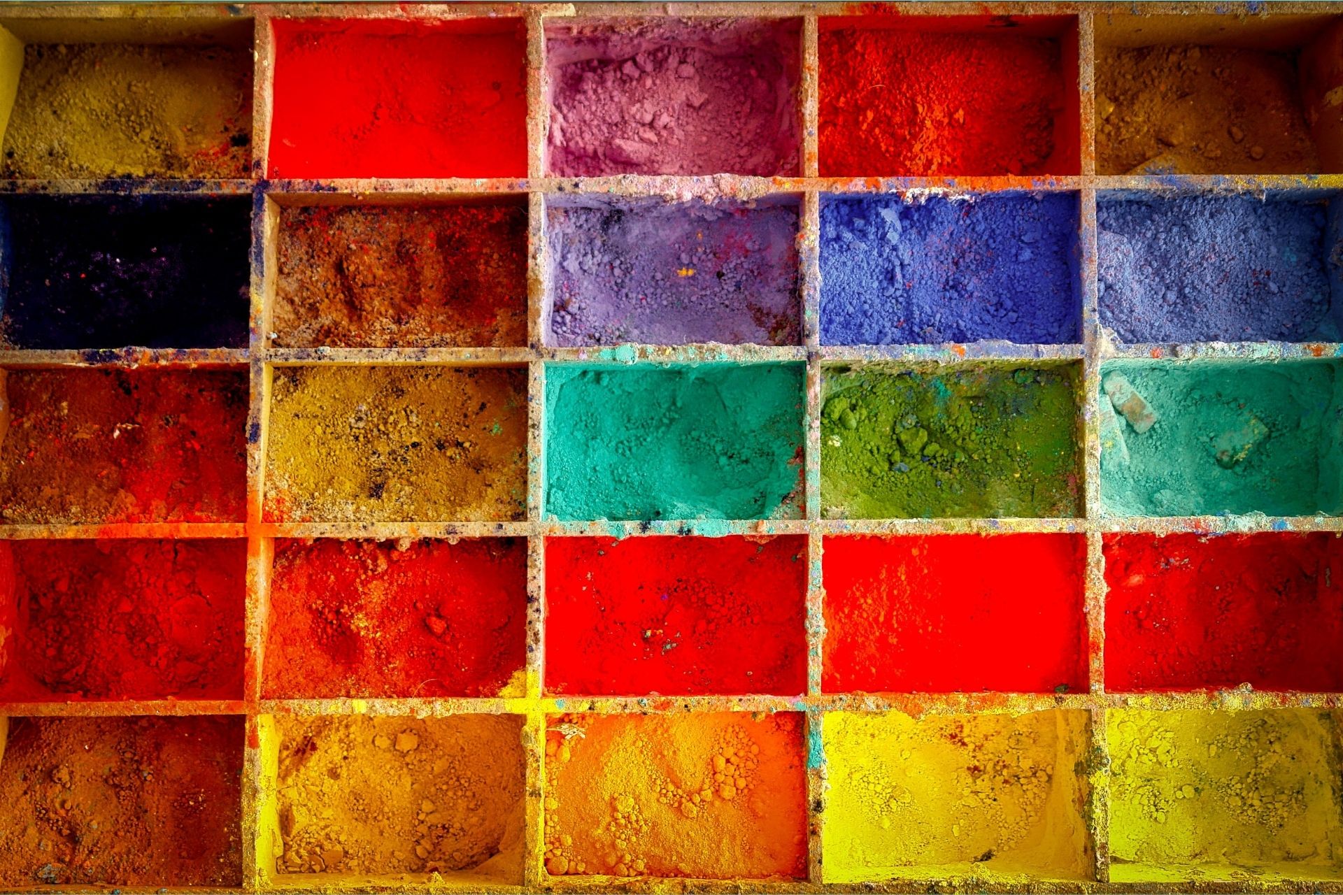
So here is the meaning of the colors, as well as the emotions they provoke in the public.
The red one
The color red can have a noticeable effect on the client, increasing their heart rate or even making them breathe rapidly. This color is actually associated with stronger sensations such as desire, love, excitement or energy.
However, red can also represent negative things like anger, violence, danger or war.
In the context of a webmarketing strategyRed should be used to capture the user's attention. It can be a part of your site that you want to highlight. This highlights the importance of bright colors in the website creation. Moreover, red can be used as theme for websites fashion, leisure, advertising, food, health...
However, avoid using the color red too much. It can have a very unpleasant effect on the visual of the platform by making it aggressive. This color is also not suitable for luxury items, sites talking about nature, professional sites ...
Yellow
Yellow is one of the most vivid color shades. This color is usually associated with happiness, optimism, competence or youth. However, yellow can also be associated with negative traits such as lack of quality.
Finally, the color yellow is associated with discounted prices and quick consumption. Yellow is a color that stands out from other colors, making it the perfect color to highlight a promotion.
When building a website, bright yellow should be used, in moderation, to bring a touch of energy or cheerfulness to your interface. To spread a sense of measured joy, use light yellow instead. This hue is ideal for capturing attention on a text or CTA button.
However, yellow can quickly become unpleasant for the eyes if it is used to excess. Moreover, bringing too much yellow on a website can make you think of a low-end product or service.
The orange
This hue is generally described as dynamic and lively. Orange is indeed linked to fun, warmth, energy or enthusiasm. But this color can also be used to call for caution.
On a website, the orange color can be used on the call to action button. It can also be used to capture the attention of consumers on promotions, different offers or other content that might interest them.
This color is therefore ideal for e-commerce sites, food or technology. As with yellow, orange should be used sparingly, as it can become overwhelming.
The green
This shade is ideal for bringing balance to a website. In terms of color psychologyGreen is associated with harmony, support, nature, envy, growth, health, money and peace.
Green is one of the easiest colors to assimilate. It is recommended to bring a relaxing and soothing effect. In addition, its focus on growth can improve consumer confidence in your business. It is therefore very suitable for sites that talk about nature, health, science or tourism. However, it is not recommended for selling luxury or high-tech products.
The blue
Widely used in the digital world, blue can be associated with different things: quality, calm, reliability, masculinity, confidence, security. This color also brings freshness and energy.
It is often requested by large companies as well as banks. Indeed, blue has the particularity to be non-invasive and also to bring an impression of reliability. It can therefore be used for platforms related to health, medicine, public services, science and also for social networks.
In the use of the color blue, one must be careful with dark shades of blue or excessive use. This can actually give an impression of insensitivity and coldness. This hue is also not recommended for a site that deals with food since it tends to suppress the appetite.
Purple
Purple is often associated with royalty. But this color can also be the symbol of creativity, sophistication, power or mystery.
To make your platform feel luxurious, you can use dark purple. However, to bring a touch of romance, purple is recommended. This color is also ideal for beauty products, astrology, massage or spiritual sites. It is the ideal color for sites aimed at women.
If the color purple is known to be soothing, it is therefore not very advisable to attract the attention of consumers. Besides, dark purple can bring a cold feeling to your site.
Brown
Brown is a warm and natural color. It is generally linked to the earth, robustness, reliability, stability or nature.
The color is mostly adapted to the site for foodIt's a great color to use for coffee or chocolate sales platforms. It is also a shade to choose for real estate, animals or finance.
However, brown can sometimes look too boring or bland. So it is not the right shade to choose to attract users' attention.
The black
Black is a very strong color and usually represents elegance, stability, sophistication, power or intelligence. However, it can also embody death, evil or rebellion.
Black is interesting when combined with secondary colors. It brings a real touch of elegance and modernity. It is the ideal color for luxury products, cosmetics and fashion sites. However, using too much black can be uncomfortable, even scary. It is therefore a shade to be used sparingly.
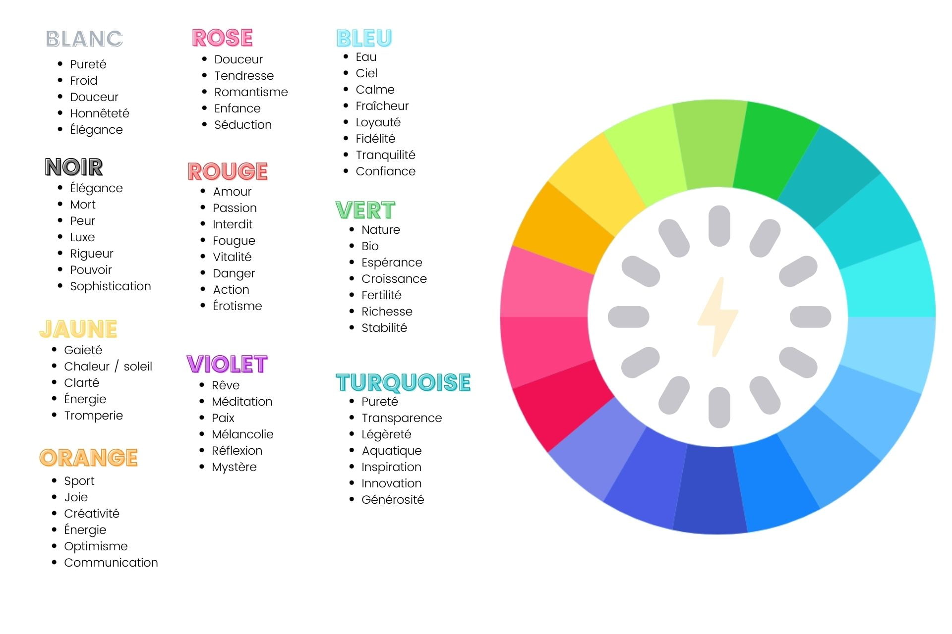
What you should know about choosing colors in web design
So now you know the importance of colors, and the importance of color psychology on the human mind, and therefore in marketing and sales. Now that you know the meaning of colors, you can get to the heart of the matter.
Now all you have to do is :
- Know your company and its values
- Know your target audience
- Apply color psychology to your products
If you follow these 3 steps, your brand image will talk about you in a much more positive way than you might think.
By the way, after reading this article on color psychology, which shades best match your brand image?
If you have any questions about the importance of color or would like professional help in getting the most effective results from the use of color psychology, please feel free to contact us !
